Filter and sort
15 products
- New Arrival
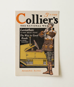 Collier’s Automobile Section, January 1914 - Edward Penfield Art Print From $20USD /🛎️ Made-to-order🏳️🌈 Queer business🌳 Plants a tree❤️ Satisfaction guaranteed
 - New Arrival
 Collier’s Vol XXVII August 1901 - Edward Penfield Art Print From $20USD /🛎️ Made-to-order🏳️🌈 Queer business🌳 Plants a tree❤️ Satisfaction guaranteed
Automatic Discount Magic
Any 2 = 10% off • Any 3 = 15% off • Any 5 = 20% off •
 Industrial Number - Edward Penfield Art Print From $20USD /🛎️ Made-to-order🏳️🌈 Queer business🌳 Plants a tree❤️ Satisfaction guaranteed
- Popular
 Hammer Throw - Edward Penfield Art Print From $20USD /🛎️ Made-to-order🏳️🌈 Queer business🌳 Plants a tree❤️ Satisfaction guaranteed
 - Popular
 College Crews - Edward Penfield Art Print From $20USD /🛎️ Made-to-order🏳️🌈 Queer business🌳 Plants a tree❤️ Satisfaction guaranteed
 - Popular
 Athlete Running - Edward Penfield Art Print From $20USD /🛎️ Made-to-order🏳️🌈 Queer business🌳 Plants a tree❤️ Satisfaction guaranteed
- Popular
 Athlete - Edward Penfield Art Print From $20USD /🛎️ Made-to-order🏳️🌈 Queer business🌳 Plants a tree❤️ Satisfaction guaranteed
 - Popular
 American Football Player - Edward Penfield Art Print From $20USD /🛎️ Made-to-order🏳️🌈 Queer business🌳 Plants a tree❤️ Satisfaction guaranteed
  Man in Carriage - Edward Penfield Art Print From $25USD /🛎️ Made-to-order🏳️🌈 Queer business🌳 Plants a tree❤️ Satisfaction guaranteed
- Popular
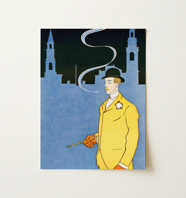
 Man in Yellow Suit - Edward Penfield Art Print From $25USD /🛎️ Made-to-order🏳️🌈 Queer business🌳 Plants a tree❤️ Satisfaction guaranteed
 - Popular
 Man Riding Bicycle - Edward Penfield Art Print From $25USD /🛎️ Made-to-order🏳️🌈 Queer business🌳 Plants a tree❤️ Satisfaction guaranteed
  Man Smoking a Pipe - Edward Penfield Art Print From $25USD /🛎️ Made-to-order🏳️🌈 Queer business🌳 Plants a tree❤️ Satisfaction guaranteed
 Man Standing in the Sea - Edward Penfield Art Print From $25USD /🛎️ Made-to-order🏳️🌈 Queer business🌳 Plants a tree❤️ Satisfaction guaranteed
 Man Reading a Book - Edward Penfield Art Print From $30USD /🛎️ Made-to-order🏳️🌈 Queer business🌳 Plants a tree❤️ Satisfaction guaranteed
 Man Reading a Book with Hares - Edward Penfield Art Print From $20USD /🛎️ Made-to-order🏳️🌈 Queer business🌳 Plants a tree❤️ Satisfaction guaranteed


Go Treasure Hunting


Edward Penfield
Edward Penfield compressed a decade of American poster art into flat planes of ink. Harper's Magazine gave him one job every month from 1893 to 1899: build a cover strong enough to stop foot traffic on a crowded sidewalk. He answered with silhouette — golfers, cyclists, women in wide hats caught mid-stride, three or four saturated colors doing the labor of a thousand pencil lines. Critics credit this economy with launching the American poster craze itself.