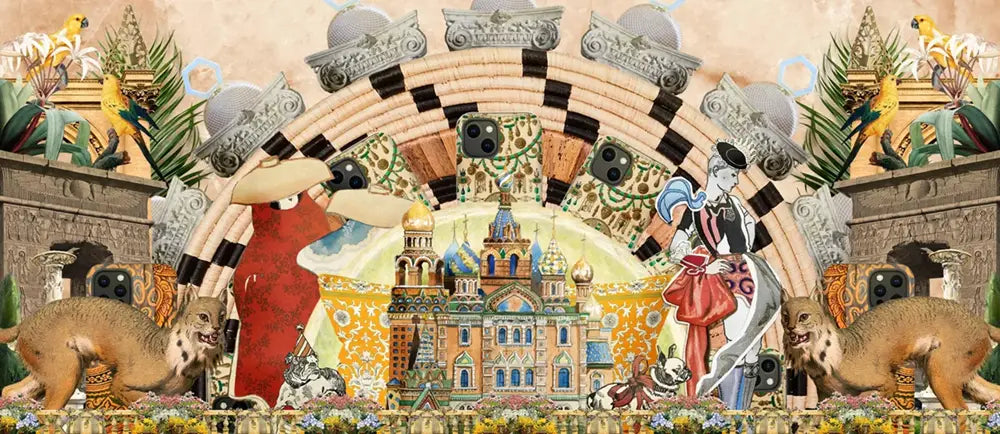

Exploring the Impact of Famous Collage Artists Who Defined the Artform: Dada to Feminism, the Harlem Renaissance, Matisse's 'Drawings with Scissors' and More…
Collage is not the art of cut and paste. It is the seduction of disruption. The poetry of paper sliced mid-thought, reassembled into defiance. It arrived not from the loins of modernism but centuries earlier—inked onto scrolls in 10th-century Japan, sewn into devotional fragments, hiding in plain sight. But don’t worry: Wikipedia already tripped over that rabbit hole. And plenty of others.
The artists gathered here—eleven shape-shifters with scissors for tongues—didn’t simply use collage. They seduced it. Shattered it. Laughed at it. Turned it inside out. Summoning its strange possibilities into new dimensions of beauty, queerness, satire, rage, seduction, protest. They didn’t define collage as much as they exploded its entrails across the walls of politics, the flesh of feminism, the afterbeats of jazz and Weimar smoke.
We must, regretfully, address the definition of the definition. No, that wasn’t a typo. You live in a world where art historians kneel at the pews of Tate and Guggenheim, so you’ve heard the gospel: that modern collage began with Pablo Picasso and Georges Braque circa 1912, when they started glueing fake wood grain and newspaper scraps into their cubist works. Papier collé. Or, as I like to call it, artisanal sticker-shock.
Of course, there was collage before Cubism. And let’s be honest... their early collages? Not the finest. Even Picasso, patron saint of ego, wouldn’t post “Bottle of Vieux Marc” to his Instagram. No, these works survived because they were birthed by names that could bully permanence into history. Not because they were glorious. And yet—they are important. Not for perfection, but for permission. They cracked open the frame. They let the wrong things in. They made room for what came next.
That’s the real gift of those janky little cubist experiments: they marked the moment collage stopped being ornamental and started being philosophical. They whispered (okay, shouted): Art is no longer bound by brush or bronze or marble. Anything that can be taken apart can be made sacred.
Each of the eleven artists in this list brought collage to a new frontier. Political. Personal. Spiritual. Ugly. Dazzling. They built mythologies out of clippings. They turned scraps into sermons. They hacked history with a glue stick. And here, then, is your invitation to the scissors’ revolution.
You’re about to meet:
A Dadaist who sliced patriarchy with kitchen knives. A Harlem artist who chorused Black identity into layered refrains. A Frenchman who drew with scissors in his final decade and made the paper sing. A feminist typographer who commandeered mass media and made it scream back.
And me? I’m a collage artist too. Or a thief. Or a mirrorball. I cut up the internet and reassemble its shards into confessions. And I’ll admit: writing this, I didn’t know them all. Not at first. Maybe you won’t either. That’s the point. The paper trail is long. The archive is crooked. Let’s follow it anyway. Just don’t expect it to be linear. Expect it to bleed.
Famous Collage Artists Who Defined the Artform
1
Hannah Höch

Hannah Höch, Cut with the Dada Kitchen Knife through the Last Weimar Beer-Belly Cultural Epoch in Germany, 1919. Collage. 44 9/10 × 35 2/5 in | 114 × 90 cm.
...
Photomontage Pioneer. Political Saboteur. Visual Anarchist.
Hannah Höch didn’t cut with safety scissors. She wielded the blade like a scalpel, dissecting the cultural corpse of Weimar Germany and stitching it back together with wire, wit, and weaponized absurdity. Born in 1889 in Gotha and sharpened in the experimental furnace of Berlin’s pre-war avant-garde, Höch fused trained craftsmanship with radical disobedience.
A graduate of the Berlin College of Arts and Crafts and the Royal Museum of Applied Arts, Höch entered the arts as a graphic designer for women’s magazines. But she wasn’t interested in pretty things. She was interested in blowing up the ideology of pretty. Collage wasn’t her medium—it was her mode of resistance.
The work of Hannah Höch is considered to be a part of what artistic style?
Dadaism was less a movement and more a strategic breakdown—and Hannah Höch was its slyest saboteur. Her artistic style is rooted firmly in Dada, the post-WWI surge of aesthetic anarchy that eviscerated logic, nationalism, and bourgeois taste with absurdity and glue.
But where her male contemporaries screamed chaos, Höch whispered it through scissors. Her pioneering use of photomontage—a technique that juxtaposed magazine cutouts, commercial ads, and political propaganda—turned mass media into feminist shrapnel. She dissected the world not to document it, but to rewire it.
Höch’s work responded to Weimar-era gender constructs and cultural debris. The “New Woman,” mass-produced beauty, fascist iconography—she sliced them up and reassembled them into visions that were part satire, part prophecy.
She didn’t merely participate in Dada. She expanded it. Höch challenged Dada’s own internal misogyny, exposing the boys’ club hiding behind the anti-art rhetoric. Her collages questioned authorship, authenticity, and the fetishization of originality long before postmodernism gave those terms a seminar.
In short: Dada was rupture. Höch was its scalpel.
She was the lone woman in a Dada boys’ club.
A movement drenched in nihilism and cabaret smoke, where chaos was both content and creed. Among male peers like Raoul Hausmann and George Grosz, Höch stood her ground and sliced deeper. Her work wasn't just anti-authoritarian; it was anti-patriarchal, anti-nationalist, anti-aesthetic. She fought fascism with found imagery. Her materials were stolen from newspapers, fashion pages, mail-order catalogues, and war-time propaganda—visual refuse transformed into razor-sharp satire.
Why was the Dada artistic movement important to future artists?
Because Dada didn’t just change what art looked like. It changed what art meant. It was the great aesthetic jailbreak—flinging open the gates of tradition and setting loose a thousand strange possibilities.
Born from the wreckage of World War I, Dada wasn’t a style. It was a strategy. A refusal. A sarcastic laugh thrown into the face of nationalism, moralism, and meaning itself. And future artists listened.
From Marcel Duchamp’s Fountain—a urinal signed “R. Mutt” and submitted to an art show—as an act of elegant vandalism, to performance art that would later erupt in protests, happenings, and guerrilla theater, Dada became a blueprint for rebellion. Art could now be a question. An interruption. A dare.
It validated:
-
Found objects as sculpture
-
Wordplay as visual structure
-
Chance as composition
-
Absurdity as critique
Dada wasn’t about chaos for chaos’ sake—it was chaos as resistance. It refused polish, logic, and market-friendliness. It spat in the face of elegance and turned collage into combat.
Its children were many: Surrealism, Fluxus, Conceptual Art, Performance, Punk, Internet meme culture, and every political poster that ever cut a dictator’s head onto a Barbie doll. Even the idea that art could be an idea owes its shape to Dada’s jagged edge.
By mocking everything, Dada made it possible to question anything. And in that rupture, artists found not just liberty—but tools.
Art stopped asking, “What’s beautiful?” It started asking, “What’s true?” And Dada, ever sarcastic, ever necessary, grinned behind the glue.
Hannah Hoch's seminal work?
Cut with the Kitchen Knife Dada Through the Last Weimar Beer-Belly Cultural Epoch of Germany (1919):
-
A sprawling, feverish photomontage nearly four feet tall
-
Choked with politicians, automatons, cabaret performers, and dismembered machinery
-
Organized like a battlefield—chaos staged with precision, commentary dressed as collage
Through this work, Höch took apart the bloated masculinity of Weimar politics and rebuilt a world teetering between progress and oblivion. The title alone is a provocation—the “kitchen knife” slashing through the “beer belly” of bloated empire. It’s both domestic tool and political blade.
Major Themes in Höch’s Work:
-
The “New Woman” as both subject and site of cultural anxiety
-
Collage as a critique of mass media and gender roles
-
Humor and grotesquerie as visual strategy
Branded degenerate by the Nazis, Höch went underground. She survived WWII in quiet defiance, preserving her practice in shadow while the world burned around her. Her influence radiates through later generations—from Barbara Kruger to Cindy Sherman, from punk zines to feminist meme culture.
Höch didn’t seek to document reality. She dismantled it. She made photomontage not just a tool of expression but a blueprint for ideological sabotage. What she cut, she remade—sharp, funny, furious, unforgettable.
Reading List
- Cut with the Dada Kitchen Knife on Smart History
- Hannah Hoch on The Art Story
- Hannah Hoch on Encycolpedia.com
- Hannah Hoch on Wikipedia
2
Romare Bearden

Romare Bearden, Empress of the Blues, 1974, acrylic and pencil on paper and printed paper on paperboard, 36 x 48 in. (91.4 x 121.9 cm.)
...
Harlem’s Storyteller. Jazz’s Visual Twin. America’s Collage Griot.
Romare Bearden didn’t paint scenes—he reconstructed them from memory, sound, and the fractured syntax of lived experience. Born in Charlotte, North Carolina in 1911 and raised amid the twin pulses of Pittsburgh steel and Harlem heat, Bearden was fluent in collage long before he ever touched a pair of scissors. Migration, jazz, and ancestral longing were already layered within him. What he did with paper and pigment was simply a method of excavation.
Educated at Boston University, NYU, and Columbia—where he studied under George Grosz—Bearden cultivated a visual language that refused to separate the personal from the political. As a Black man working in 20th-century America, he didn’t paint abstractions of struggle. He painted its architecture—porches, city blocks, baptismal pools, brass bands, domestic rituals—all kaleidoscoped into fierce, prismatic compositions.
Key Materials and Techniques:
-
Printed paper, fabric, acrylic, graphite
-
Overlapping silhouettes, rhythmic layering
-
Juxtapositions evoking improvisation and narrative compression
In works like Empress of the Blues (1974), you don’t just see a woman. You hear her. She moans from the paper’s grain, shoulders squared with grace and fatigue. Bearden’s collages hum with Afro-Atlantic spiritual density—a Southern church service spliced with subway static and trumpet calls. Every surface is crowded, not with clutter, but with history.
Major Themes:
-
Memory as communal inheritance
-
The Black American South and Northern urban diaspora
-
Jazz structure applied to visual composition
Raised in a Harlem home that became a salon for thinkers and artists—from W.E.B. Du Bois to Langston Hughes—Bearden witnessed the Harlem Renaissance not from the outside but from the parlor. He didn’t just inherit its legacy; he stretched it into the next century.
Bearden’s collage technique echoed the pulse of improvisational music. He worked like a jazz musician: repetition with variation, syncopated cuts, visual riffs across a single theme. He often said, “I try to show that when some things are taken out of context, they can still speak a truth.” He was speaking of photographs. He was speaking of people.
Legacy Beyond the Canvas:
-
1964: Appointed first art director of the Harlem Cultural Council
-
Co-founded Cinque Gallery and The Studio Museum in Harlem
-
Collaborated on set designs for Alvin Ailey’s American Dance Theater
-
Illustrated books, wrote plays, composed music
The Romare Bearden Foundation, founded in 1990, continues to support artists and scholars in his name. But his true afterlife lives in every artist who collages from chaos, who dares to build coherence from fracture. Bearden didn’t depict Harlem. He translated it. His works are not portraits. They’re spiritual blueprints—layered, sonic, fiercely alive.
Reading List
- Empress of the Blues in American Art
- Harlem Renaissance on History.com
- Romare Bearden on Biography.com
- Romare Bearden on Brittanica.com
- Romare Bearden on Encyclopedia.com
- Romare Bearden on Holmes Art Gallery
- The Romare Bearden Foundation
3
Henri Matisse

Henri Matisse, Zulma, 1950. Gouache on paper. 108 x 60 inches.
...
Scissors in Hand. Color Unleashed. Art Reborn.
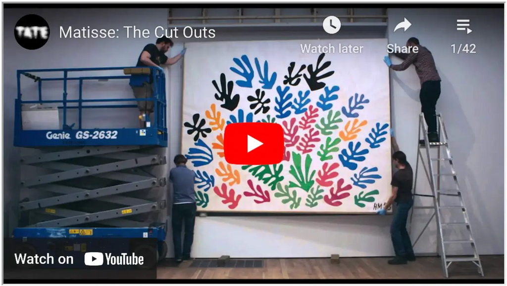
Henri Matisse didn’t fade quietly into old age. He ignited. When illness made painting arduous, he stood defiant—with shears in one hand and chromatic thunder in the other. His late-life works, the famed cut-outs, weren’t a farewell. They were a second adolescence. A riot of color born from paper, not pigment. He called it “drawing with scissors,” but what he really did was orchestrate color into motion.
In the 1940s, Matisse retreated to Vence in the south of France, body weakened but vision sharpened. Unable to stand at an easel, he turned to gouache-painted sheets and began slicing. The process was tactile, immediate—liberated from the long rituals of oils and brushes. It was collage, yes, but it moved with the logic of dance and the boldness of stained glass.
Why It Changed Everything:
-
Forged a new medium using scissors, gouache, and intuition
-
Rejected line in favor of color as structure
-
Expanded abstraction while rooting it in organic form
Zulma (1950) is no still life. It’s a monument to sensual rhythm—standing 108 inches tall, cut into shimmering planes of color, stitched together like a hymn. The figure is reduced but intensified, shaped from confidence and curve. Matisse wasn’t editing the body. He was distilling it.
Core Themes in the Cut-Outs:
-
Movement over representation
-
Joy as resistance
-
Nature reimagined through paper and breath
These weren’t sketches—they were final statements. Each pinned piece was alive with possibility, evolving on studio walls like butterflies mid-transformation. The logistics of preserving them later became an art form in itself. Conservationists today still chase the ghost of his original compositions, pinned with straight edges and quiet urgency.
And yet, these pieces feel timeless. Matisse’s cut-outs would influence everything from modern illustration and advertising to fashion editorials and contemporary abstract painting. They arrived at a moment when the art world thirsted for theory and got, instead, ecstasy.
Matisse died in 1954. But in those final years, he remade modernism from a wheelchair—with scissors, pinned paper, and a belief that art could still astonish. Not despite limitations. But because of them.
Reading List
- henrimatisse.org
- Henri Matisse cut-outs on Wikipedia
- Henri Matisse cut-outs on moma.org - exhibition
- Henri Matisse cut-outs on moma.org - process
- Henri Matisse cut-outs on Wide Walls
- Henri Matisse cut-outs on YouTube
- Henri Matisse creating one of his cutouts
- How Matisse's cut-outs took over the illustration world
- How to Read a Matisse - The Met
- Conserving the Swimming Pool
- Zulma on moma.org
4
Barbara Kruger

Barbara Kruger, Untitled (Your Body is a Battleground), 1989. Photographic silkscreen on vinyl. 112 x 112 in. (284.48 x 284.48 cm).
...
Typography’s Guerilla General
Barbara Kruger doesn’t ask questions. She interrupts them. Her work lands like a billboard in the brain—declarative, dissecting, demanding. Blending mass media with conceptual fury, Kruger transformed the flat language of advertising into a site of feminist insurgency.
Born in 1945 in Newark, New Jersey, she was raised on the twin screens of Catholic guilt and American television. After studying at Syracuse and Parsons, Kruger landed at Mademoiselle magazine, where she swiftly rose to become chief designer. She understood visual seduction because she built it—kerning power into commodity and back again.
But something snapped. She took that knowledge and reversed the current. Instead of feeding capitalism’s hungers, she starved it—with appropriation, contradiction, and fierce red overlays.
Signature Style:
-
Black-and-white photographs
-
Overlaid white-on-red Futura Bold Oblique or Helvetica Ultra Condensed
-
Short, blistering phrases that read like accusations—or confessions
Kruger’s aesthetic—once seen, never forgotten—is more than design. It’s confrontation. Her art interrogates the weaponry of language and the architecture of desire. And it does so in giant, public formats: museum walls, bus stops, magazine pages, subway platforms.
Famous Works That Burned Through the Canon:
-
Untitled (Your Body is a Battleground) (1989):
A woman’s face split in stark symmetry—halved between photographic clarity and negative exposure. Over it, the phrase: “Your body is a battleground.” Created in response to anti-abortion legislation, the image became protest placard, feminist manifesto, and cultural litmus test in one blow. -
Untitled (I Shop Therefore I Am) (1987):
A credit card clutched like a dagger. A consumerist creed turned existential crisis. Kruger didn’t just critique capitalism—she exposed it as theology.
Core Themes Across Her Oeuvre:
-
Identity and gender as constructs
-
The psychological violence of media
-
The blurred border between critique and complicity
Kruger's work draws from feminist film theory, structuralism, and postmodern philosophy—but never at the expense of legibility. Her work isn’t for the initiated. It’s for anyone with a gaze and a gut. She doesn’t make you decode. She makes you choose.
Long-Term Impact:
-
A foundational voice in the Pictures Generation
-
Influenced generations of activists, designers, and conceptual artists
-
Continues to create large-scale installations across the globe, from museums to outdoor architecture
Barbara Kruger’s brilliance lies in compression. She distills whole ideologies into four-word ruptures. Her work doesn’t whisper through gallery halls. It shouts from the scaffolding of culture itself—then asks why we were so quiet before.
Reading List
- Barbara Kruger in her own words
- Barbara Kruger on Artland
- Barbara Kruger on The Broad
- Barbara Kruger on jwa.org
- Barbara Kruger on moma.org
-
Barbara Kruger on Wikipedia
- Untitled (I Shop Therefore I Am)
- Untitled (Your Body is a Battleground) on The Broad
- The history of Untitled (Your Body is a Battleground)
5
Robert Rauschenberg

Robert Rauschenberg, Buffalo II, 1964. Oil and silkscreen ink on canvas
96 x 72 in. (243.8 x 183.8 cm.).
...
The Alchemist of the Everyday
Robert Rauschenberg didn’t wait for permission to call garbage art. He canonized it. Where others saw refuse, he saw resonance. A cardboard box? A time capsule. A flattened tire? A chorus line. He was less a painter than a scavenger-oracle, coaxing revelation from American entropy.
Born in Port Arthur, Texas in 1925, Rauschenberg took a serpentine route through art school—studying in Kansas City, at the Académie Julian in Paris, and eventually at Black Mountain College under Josef Albers. But it wasn’t Bauhaus rigor that shaped him. It was rebellion. The freedom to find a flattened newspaper on the street and declare it sacred.
What Rauschenberg did differently:
-
Merged painting and sculpture through “Combines”
-
Embedded real-world ephemera into high-art spaces
-
Foretold Pop Art’s obsession with mass culture without succumbing to irony
His Combines—half-canvas, half-construction—defied categorization. They were visual improvisations made from goat carcasses, rubber tires, bed quilts, street signs, and brushstrokes that looked like footprints. These weren’t simply mixed media—they were collisions.
Buffalo II (1964), created with oil and silkscreen, showcases Rauschenberg at full velocity. JFK’s face, Coca-Cola logos, and fighter jets jostle for space in a saturated blur of national identity. The piece is less a composition than a political hallucination. It doesn’t ask what America means—it shoves the whole dream into your chest and waits for your lungs to respond.
Materials that became Rauschenberg’s vocabulary:
-
Newsprint, photographs, oil, fabric, taxidermy
-
Found detritus collected from NYC streets
-
Industrial silkscreen processes reimagined as painterly tools
Recurring Themes:
-
The porous boundaries between art and life
-
Political chaos rendered through aesthetic overload
-
Impermanence as both method and message
Rauschenberg rewrote the rules of art not with theory, but with gumption. He erased a Willem de Kooning drawing just to see if he could. He co-founded Experiments in Art and Technology (E.A.T.) in 1966, bridging artists with engineers long before Silicon Valley made it chic. His collaborations with choreographers like Merce Cunningham turned performance into moving collage—bodies as live cut-outs against the backdrop of modern anxiety.
Long-Term Influence:
-
Preceded and influenced the Pop Art movement
-
Inspired generations of artists, from Jasper Johns to David Wojnarowicz
-
Created a blueprint for mixed media as protest, poetry, and process
Branden W. Joseph wrote that Rauschenberg's art acted as stimulus, not sermon. His pieces aren’t tidy arguments. They’re provocations—dense, open-ended, full of static and swing.
Rauschenberg made mess a virtue. His art said: Here is the world, unsorted and unwieldy. Now what will you do with it?
The studio wasn’t separate from the sidewalk. The materials weren’t neutral—they were loaded. And Rauschenberg, ever the disobedient archivist, built a practice out of saying yes to everything: motion, noise, fracture, glue. He didn’t illustrate a culture. He jammed it through a screen, let it drip, and called it now.
Reading List
- The Robert Rauschenberg Foundation
- Robert Rauschenberg on the Art Channel
- Robert Rauschenberg on Christie's
- Robert Rauschenberg on Gagosian
- Robert Rauschenberg on moma.org
- Robert Rauschenberg on MOCA
- Robert Rauschenberg on Nowness
- Robert Rauschenberg on tate.org.uk
- Robert Rauschenberg on Wikipedia
-
Buffalo II on christies.com
6
Kurt Schwitters
 Germany_Materials_collage_Measurements_sheet-_31_1_4_x_24_inches_79.37_x_6_b538c315-31e4-4282-863e-22ce6c89cef1_1024x1024.webp?v=1693966009" data-files="Kurt_Schwitters_German_1887-1948_Estate_of_Kurt_Schwitters_Artists_Rights_Society_ARS_New_York_VG_Bild-Kunst_Germany_Materials_collage_Measurements_sheet-_31_1_4_x_24_inches_79.37_x_6_b538c315-31e4-4282-863e-22ce6c89cef1.webp" data-ai="1">
Kurt Schwitters, Difficult, 1942-43. Collage. 31.25 x 24 inches (79.37 x 60.96 cm).
...
The Patron Saint of Leftovers
If Dada was a howl, Kurt Schwitters was its echo trapped in a cigarette carton. He didn’t scream anarchy—he whispered it with old tram tickets, candy wrappers, and shoe polish labels. Born in 1887 in Hanover, Germany, Schwitters took collage out of political protest and into existential architecture. Where others saw a pamphlet or a torn receipt, he saw structural integrity. He saw poetry.
Schwitters invented his own movement: Merz—a nonsense word snatched mid-syllable from "Kommerzbank." Merz wasn’t just a style. It was a belief system for post-war survival. The idea was simple: if the world had been smashed to pieces by artillery, inflation, and ideology, then art had to start from rubble. Beauty, for Schwitters, was born in the bin.
Key Features of Merz:
-
Constructed from refuse and printed ephemera
-
Aesthetic of chaos made methodical
-
Intimate scale but infinite implication
While the Berlin Dadaists were launching manifestos like molotovs, Schwitters worked alone, away from the capital’s noise, in a quiet northern city that barely tolerated him. He wasn’t trying to shock. He was trying to rebuild—bit by bit, like a mason with only junk and instinct.
Difficult (1942–43) exemplifies this ethos: scraps layered in dense visual sediment, textures clashing and cooperating. The work is intimate, tactile, and quietly confrontational. It asks no questions. It simply insists on being there.
Why Schwitters Mattered:
-
Bridged Dadaism and Constructivism with radical empathy
-
Reclaimed the dignity of discarded material
-
Prefigured installation art, minimalism, and modern assemblage
He didn’t stop at collage. Schwitters built his own universe inside actual rooms. His Merzbau—part cathedral, part hoarder’s hallucination—transformed entire interiors into sculptural environments. Columns of cardboard and detritus spiraled like makeshift stalagmites. It was Gesamtkunstwerk for the disillusioned—a total work of art that said: the center cannot hold, so let’s make a shrine of the fragments.
Fleeing Nazi persecution, Schwitters moved through Norway and eventually to England, where he was interned as an enemy alien at Hutchinson Camp. Even there, he continued making art—his internment cell turning into a studio of salvaged dreams. By the end of his life, he had created over 8,000 works; only a fraction survive. But survival was always his medium.
Legacy and Influence:
-
Inspired artists like Robert Rauschenberg, Jessica Stockholder, and John Stezaker
-
Helped redefine collage as not just composition, but philosophy
-
Proved that ephemera could outlast empires
Schwitters never sought belonging. He built his own world from the parts nobody wanted. His genius wasn’t in defiance—it was in accumulation. He didn’t collage for provocation. He collaged because there was no other way to make sense of the ruins.
To encounter a Schwitters piece is to witness patience disguised as chaos. He didn’t fix the world. He rerouted its debris into a logic only the truly awake can read.
Reading List
- Kurt Schwitters on Wikipedia
- Kurt Schwitters on Artnet
- Kurt Schwitters on Retroavangarda
- Kurt Schwitters Interned
- Kurt Schwitters' Fascinating Found Objects
- Kurt Schwitters' Exhibition Tour at Berkeley
- Kurt Schwitters Documentary
- Difficult on Buffalo AKG
- Merz on Wikipedia
7
Eduardo Paolozzi
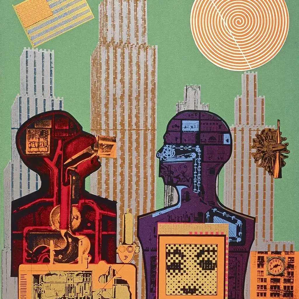
...
The Engineer of Pop’s Mad Machinery
Eduardo Paolozzi was a human Xerox machine with a philosopher’s wiring and a sci-fi collector’s appetite. Born in 1924 in Leith, Edinburgh, to Italian immigrants, Paolozzi became one of the early architects of Pop Art, but his version was grittier—less bubblegum, more scrapyard opera. His collages didn’t dazzle with surface sheen; they short-circuited it, soldered it, and rebooted it as techno-surreal prophecy.
He wasn’t interested in nostalgia. Paolozzi was obsessed with what came next. His early works were an unruly cocktail of mass media, Surrealism, and machine logic—images culled from magazines, instruction manuals, cartoons, and ads. He turned the future into a collage of our own making—assembled from the remnants of marketing fantasies and Cold War anxiety.
Core Elements of Paolozzi’s Style:
-
Juxtaposition of American consumer imagery and British skepticism
-
Integration of machine parts, commercial prints, and cybernetic motifs
-
Aesthetic oscillating between mechanical precision and conceptual disruption
In Wittgenstein in New York (1965), Paolozzi doesn’t illustrate the Austrian philosopher—he remixes him. The collage hums with a language of fragments: a footnote to logic crashing into a Manhattan skyline, a circuit board dreaming in technicolor. It’s not homage. It’s interrogation.
Recurring Themes:
-
The uneasy seduction of American pop culture
-
Tension between humanism and mechanization
-
Surrealism meets science fiction in a world of mass production
Paolozzi’s practice moved far beyond paper. He carved aluminum gods for modern cities. He built mosaics for London’s underground—most notably the fevered explosion of colored tiles and biomorphic androids at Tottenham Court Road station. There, the subway became a motherboard, and passengers, unwitting data packets.
He viewed collage not as a technique, but as a worldview. To Paolozzi, the world was already a collage—humans, machines, empires, and fictions layered atop one another, pixel by pixel, cog by cog.
Lasting Contributions:
-
Helped launch the Independent Group, precursor to British Pop
-
Created pioneering screenprints that foreshadowed digital art
-
Sculptural work fused ancient myth with industrial detritus
-
Reframed artmaking as a speculative, posthuman endeavor
Eduardo Paolozzi made visual philosophy from surplus catalogs and mainframe diagrams. His collages were not decorative—they were diagnostic. A glitch report on late capitalism. A love letter to failed utopias. A user manual for a species caught between dream and download.
Where others celebrated Pop’s glitz, Paolozzi revealed its rust. And in that corrosion, he found an art that could survive the future it feared.
Reading List
- Eduardo Paolozzi on Wikipedia
- Eduardo Paolozzi on Artlex
- Eduardo Paolozzi on The Art Story
- Eduardo Paolozzi on Artnet
- Eduardo Paolozzi on the National Galleries of Scotland
- Eduardo Paolozzi Pioneers Pop Art
- Eduardo Paolozzi's Tottenham Court Road Mosaic
- Eduardo Paolozzi by Phil Jupitus
- Wittgenstein in New York on tate.org.uk
8
Martha Rosler
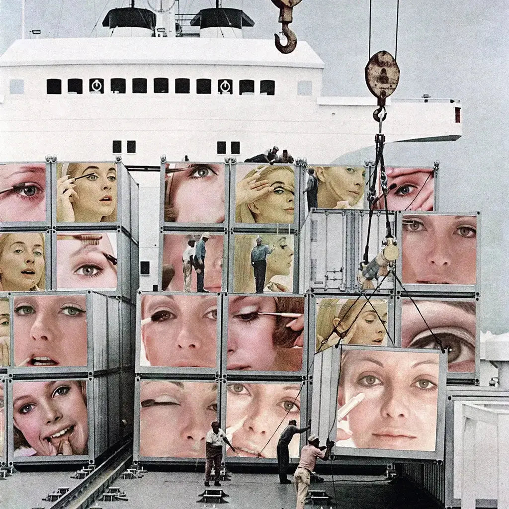
Martha Rosler, Cargo Cult, from the series Body Beautiful, or Beauty Knows No Pain, 1966–72. Photomontage printed as photograph. 39 1/2 x 30 1/4 in.
...
The Kitchen as War Room, the Magazine as Weapon
Martha Rosler didn’t critique mass culture from a distance—she flayed it from within. Born in 1943 in Brooklyn, Rosler came of age in a country advertising its own contradictions: domestic bliss backed by militarism, feminine grace tethered to capitalist consumption. Her art sliced that illusion open and made us stare at the gears inside.
Rosler is a conceptual artist in the most muscular sense. She works across media—photography, video, text, installation, performance—but every piece shares a core engine: demolition. Her targets are gender, war, architecture, media, and everything wrapped in American myth.
Her key tool? The photomontage.
Rosler’s photomontages are not collages in the decorative sense. They are coded documents—visual essays in which magazine models are embedded with grenades, kitchen counters sprout missiles, and glossy smiles burn under the heat of televised atrocity.
In Cargo Cult from the series Body Beautiful, or Beauty Knows No Pain (1966–72), she juxtaposes advertising’s polished femininity with brutalist mechanical insertions. It’s surrealism with teeth. The absurdity isn’t whimsical. It’s systemic.
Major Themes in Rosler’s Work:
-
Domestic space as a site of political conditioning
-
The female body reframed through critique, not spectacle
-
War, consumerism, and media complicity entangled in daily ritual
In her infamous Semiotics of the Kitchen (1975), a deadpan Rosler performs a parody of a cooking show. She names utensils alphabetically—“grater,” “ice pick,” “ladle”—wielding each with growing menace. By the time she reaches “Z,” the subtext is unmistakable: language has failed. Rage remains.
Why It Still Matters:
-
Foremother of feminist conceptual art
-
One of the first to weaponize video and performance in domestic critique
-
Her work prefigures meme logic, remix culture, and digital protest aesthetics
Rosler didn’t just deconstruct media—she reconstructed the viewer. Her art doesn’t ask, “What is this image saying?” It asks, “Why did you believe it in the first place?”
She has consistently rejected the polished veneer of the gallery system, often exhibiting in community centers, union halls, or street spaces. Yet her influence runs deep: from the Guerrilla Girls to TikTok feminists dissecting beauty filters, her DNA is in every visual protest that knows how to make satire sting.
To encounter Rosler’s work is to feel seen and implicated all at once. She doesn’t offer sanctuary. She offers clarity. And in a world built on seduction and screens, that’s the sharpest cut of all.
Reading List
- martharosler.net
- Martha Rosler on The Art Story
- Cargo Cult at the AGNSW
- Martha Rosler on tate.org.uk
- Martha Rosler on Wikipedia
9
John Heartfield
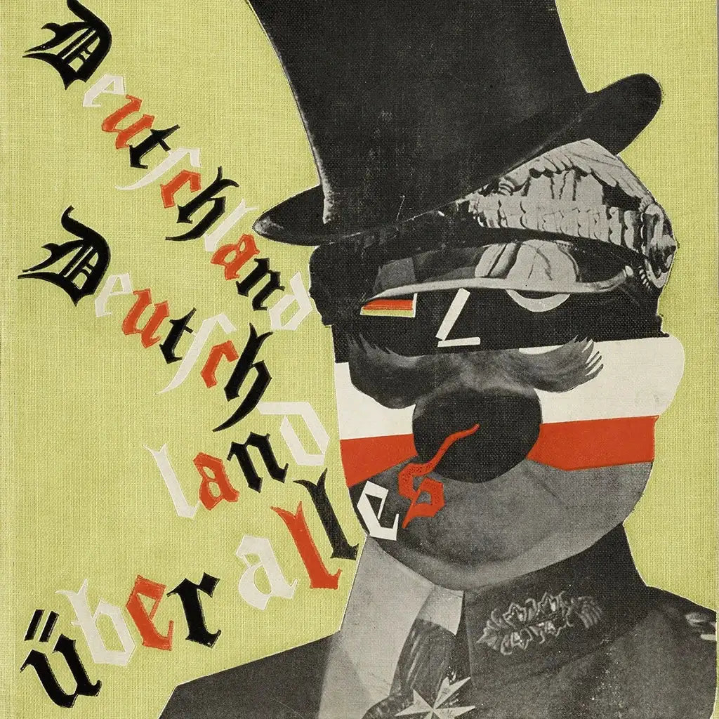
John Heartfield, Cover art for Kurt Tucholsky, Deutschland, Deutschland über alles, 1929 © The Heartfield Community of Heirs / VG Bild-Kunst, Bonn 2020 Akademie der Künste, Berlin.
...
Cut-and-Paste Resistance, Printed in Blood
John Heartfield didn’t collage for aesthetic pleasure—he collaged like a man barricading his front door with furniture while the boots echoed closer. Born Helmut Herzfeld in 1891, he Germanized his name into a protest—anglicizing it as “John Heartfield” during World War I to declare his rejection of German nationalism. Even his name was a montage.
A pioneer of photomontage, Heartfield weaponized the printing press against tyranny. While Dada flickered with surreal chaos, Heartfield forged its cousin: militant montage, sharp as a guillotine and twice as fast. He wasn’t aiming for ambiguity. He was aiming to wound the authoritarian image with its own reflection.
The Battlefield Was the Page
From 1930 to 1938, Heartfield designed over 240 politically loaded montages for the leftist Arbeiter-Illustrierte-Zeitung (AIZ)—each one a visual grenade lobbed at Hitler, capitalism, militarism, and hypocrisy. His works were printed, smuggled, and circulated across Europe in a time when paper was more dangerous than bullets.
In his searing cover for Deutschland, Deutschland über alles (1929), a monstrous German bourgeoisie sits atop a pile of corpses—cigarette drooping from mouth, eyes glazed with arrogance. No symbolism. Just savagery.
Hallmarks of Heartfield’s Practice:
-
Photomontage as mass communication, not gallery ornament
-
Meticulous image manipulation before Photoshop existed
-
Use of satire to dissect propaganda with surgical precision
He composed with scissors and glue but thought like a war correspondent. Each image was a code—meant to be read, not simply seen. Irony sharpened into urgency.
Iconic Themes:
-
Anti-fascism and state critique
-
Deconstruction of Nazi iconography
-
The image as political weapon, not passive document
Heartfield's montages weren’t confined to metaphor. They were intercepted, banned, hunted. The Gestapo wanted him silenced; exhibitions were raided; his life was in constant flight—from Berlin to Prague to London. But exile did not blunt his edge. He continued producing work for theater, publishing, and political movements abroad.
Legacy Across Time and Borders:
-
Direct influence on political art movements across the Eastern bloc
-
Visual forefather to artists like Martha Rosler, Winston Smith, and David King
-
His techniques inform punk zines, agitprop posters, and viral protest imagery today
Heartfield showed that the image could bite back. His montages didn’t hide behind abstraction. They spoke plainly in the language of fury. He used the tools of manipulation—cropped photos, stark typography, theatrical composition—to turn propaganda against itself.
Today, when memes destabilize governments and photomontage rides the algorithm, Heartfield’s legacy pulses beneath every jpeg soaked in critique. He didn’t create art for contemplation. He created it for the fight. In every frame, he asked: What will you do now that you’ve seen this? And what will it cost you if you look away?
Reading List
- johnheartfield.com
- Deutschland, Deutschland über alles
- John Heartfield on The Art Story
- John Heartfield at the Getty
- John Heartfield on Encyclopedia.com
- John Heartfield on Open Culture
- John Heartfield's biography by his grandson
- John Heartfield on Wikipedia
10
Pablo Picasso

Pablo Picasso, The Bottle of Vieux Marc, 1913. Cut-and-pasted printed wallpapers, newspaper, charcoal, gouache, and pins on laid paper, 24 13/16 × 19 5/16 in. (63 × 49 cm).
...
The Collage That Didn’t Want to Be Famous AKA which artist made the concept of collage into a form of art in 1912?
Pablo Picasso didn’t invent collage. But he’s why the museums pretend he did. In 1912, armed with scissors, oilcloth, and irreverence, Picasso began slipping bits of printed matter into his paintings—newspaper, faux bois wallpaper, rope.
That year, Still Life with Chair Caning became the first modern artwork to embed everyday ephemera within a painted frame. What started as prankish experimentation between him and Georges Braque detonated into the birth of Cubist collage, or as they called it: papier collé. A radical gesture that folded printed oilcloth into painting, framed with an actual rope, and dared the academy to define it. It wasn’t just visual art anymore. It was an interruption. A rupture.
The image of Still Life with Chair Caning—an oval canvas hosting a piece of oilcloth printed to mimic woven cane—wasn’t just mimetic. It was defiant. He didn’t paint the chair. He glued in its imitation. It wasn’t illusion. It was quotation. With that rope, Picasso wasn’t containing the image; he was drawing a line between old world and new.
This was the beginning of Cubist collage, a seismic shift where painting stopped pretending and started constructing. Texture overtook perspective. Material mocked mastery. The canvas became a site of argument, not depiction. And from that friction, the modern collage was born.
Picasso’s collage work challenged more than medium. It cracked open philosophy. Art could now incorporate the world rather than simply interpret it. It asked: What if a painting didn’t represent reality—but was reality, layered, fractured, and pieced together like the headlines of a day you wish you could rewrite?
Picasso’s collage phase wasn’t his most technically refined—but it was arguably his most radical. These works challenged what could be called “art,” who could make it, and how it could be made. They reduced form to fragments, materials to mischievous possibilities, and meaning to a negotiated chaos.
Material Matters:
-
Wallpaper masquerading as marble
-
Newspaper clippings folded into space
-
Gouache and charcoal pinned into false depth
In The Bottle of Vieux Marc (1913), there’s no clear subject—just slivers of commercial print, a flattened table, and illusions splintered like language under pressure. It’s not a still life. It’s a ransom note for painting’s future.
Core Disruptions:
-
Collage as an anti-illusionistic tool
-
Merging “low” culture with “high” art
-
Upending perspective, space, and hierarchy
Picasso and Braque didn’t romanticize the cut. They were tacticians. Their Cubist collages sliced open Western pictorial conventions and filled the wound with modernity’s debris. Rope wasn’t symbolic. It was border. Newspaper wasn’t content. It was surface and texture and economic subtext.
Legacy and Fallout:
-
Influenced Dada, Surrealism, Abstract Expressionism, and Pop
-
Laid groundwork for artists like Hockney, Rauschenberg, and Kippenberger
-
Redefined painting as a site of construction, not illusion
These collages weren’t made to be beautiful. They were designed to be difficult—misbehaving at the edge of abstraction. They poked holes in the picture plane and refused to patch them. They stared down the gallery and said: we’re not here to perform clarity.
Picasso didn’t stay long in the collage space—he was too restless, too prolific—but the rupture remained. He had cracked the aura of the singular image, the singular medium, the singular truth. Art, once sacred, now had the stink of print shops and glue pots. And in that stink, a revolution grew.
Collage under Picasso became less about construction and more about subversion. A way to flatten history. To explode linearity. To reveal that an image is never innocent—it is always stitched together, haunted by what was cut away.
Reading List
- pablopicasso.org
- The Bottle of Vieux Marc at the Met
- Guitar and Wine Glass at the Met
- Still Life with Chair Caning
- Still Life with Chair Caning on Khan Academy
- Pablo Picasso on Wikipedia
- Pablo Picasso Revolutionized Art Through Collage
- Picasso's Impact on the Art World
- Picasso's Influence on American Artists
11
Georges Braque

Georges Braque, Fruit Dish and Glass, 1912. Charcoal, wallpaper, gouache, paper, paperboard.
...
The Quiet Collagist Who Dismantled the Frame
If Picasso was the thunderclap, Georges Braque was the tremor beneath your feet. He didn’t court spectacle. He composed it in silence—deconstructing space with a draftsman’s restraint and a poet’s sleight of hand. In 1912, while working alongside Picasso, Braque co-invented papier collé—pasted paper collage—and in doing so, punctured the illusionism Western painting had been perfecting since the Renaissance.
Fruit Dish and Glass (1912) is not a picture of a fruit dish. It’s the idea of one: fragmented, suspended, and deliberately deceptive. Faux-wood wallpaper slices across the surface like a conceptual joke, mocking the idea of painted illusion. Braque wasn’t interested in mimicking the world. He wanted to flatten it into language—space reimagined as syntax.
Key Materials and Techniques:
-
Charcoal and gouache layered with commercially printed paper
-
Use of stenciled lettering, pigment mixed with sand, and visual puns
-
Juxtaposition of high formalism with mass-produced surfaces
Braque’s work during this Cubist collage phase (1912–1914) was an act of philosophical restraint. He didn’t want to shock; he wanted to shift the viewer’s weight. His collages unhinge perspective not with volume but with vibration—each edge a hesitation, each fragment a new articulation of surface.
Theoretical Interventions:
-
Collage as a critique of illusionistic depth
-
Typography as image
-
Tactile disruption as a painterly device
Where Picasso leaned into flamboyant rupture, Braque sought quiet radicalism. His stenciled words and grain textures weren’t just playful—they questioned the trust we place in representation. A wood texture that isn’t wood. A wine glass that exists only in shadow and shape. A painted still life that denies visibility even as it performs it.
Lasting Impact:
-
Redefined the boundaries between painting and object
-
Inspired future collage artists including Schwitters, Johns, and Stockholder
-
Helped initiate modernism’s interrogation of flatness, materiality, and signification
During their collaboration, Braque and Picasso created a visual language built from debris: advertisements, café menus, fragments of reality flung into aesthetic reconsideration. But while Picasso’s collage legacy tends to dominate the narrative, Braque’s contribution was no less tectonic. His works are not grand gestures. They are quiet detonations, rippling outward through time.
Braque’s collages taught generations that fragmentation can be form. That surface is not passive. That silence, too, has structure. In Fruit Dish and Glass, the rupture is gentle—but it never quite heals. It leaves the image breathing in pieces, inviting the viewer to rebuild it. Not to see the thing, but to feel what looking has become.
Reading List
- George Braques on The Art Story
- George Braque on Wikipedia
- George Braque's still lifes
- George Braque and the Cubist still life
- George Braque's Bottle of Rum
- Fruit Dish and Glass on Wikipedia
- How Braque became one of the greats
- Paint like George Braque
Conclusion
Collage isn’t potential—it’s pressure. The pressure to salvage, to rupture, to rebuild. It’s the artform born not of abundance but of aftermath. These eleven artists didn’t just redefine aesthetics. They built entire dialects from cultural wreckage, gluing new narratives where certainty had collapsed. Each used collage as a scalpel, as a protest sign, as a love letter, as a battlefield. They didn't decorate the world. They reassembled it from the detritus it tried to hide.
Whether layering found objects, repurposing propaganda, or slicing through domestic stereotypes, these collage artists carved meaning from contradiction. The materials are mundane—wallpaper, magazines, sugar wrappers—but the meanings are tectonic. They weaponized beauty. They exposed myth. They rendered society’s shiny lies as clutter cut into truth.
These were not just artists. They were codebreakers.
Their methods—improvisation, disruption, assemblage—mapped entire histories of resistance, migration, gender, race, and identity. And their legacy? It’s alive. You see it every time an image glitches on your feed, every time a billboard is remixed into protest, every time scissors hit paper and truth slips from the edges.
Collage is not nostalgia. It’s now. A radical form still splicing the world open—and daring us to look closer.
—
For Lazy Nerds & Visual Learners
Famous Collage Artists on YouTube
 Main image: Eduardo Paolozzi, Turing 6, 2001. Colour photo-screenprint. 64 × 53 cm.